Categories
Street Photography

Candid Photography: People Not Doing Stuff

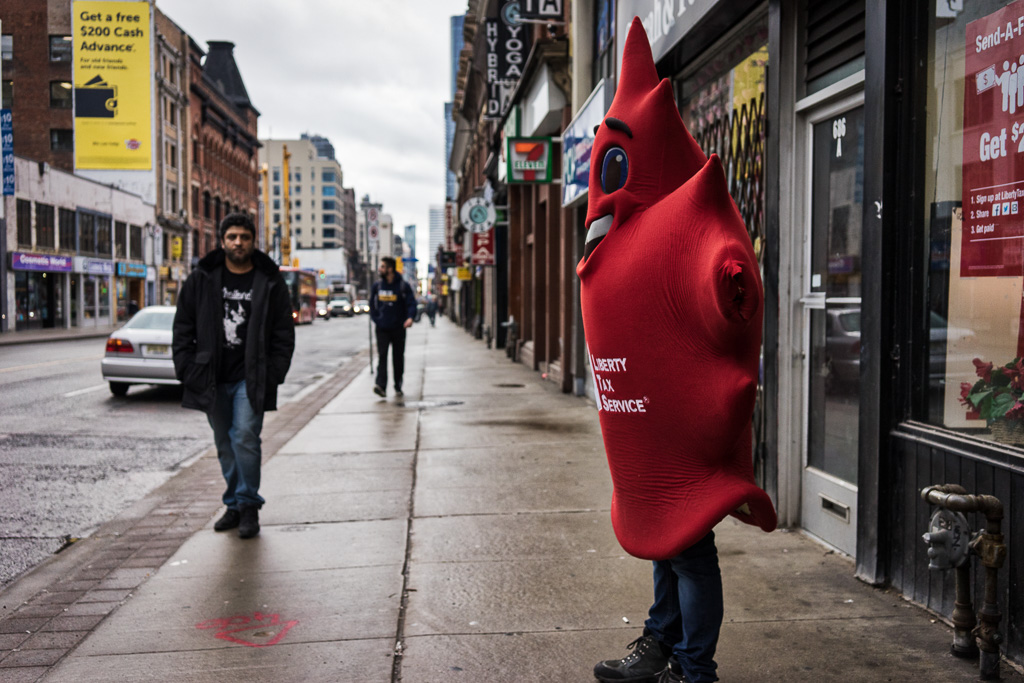
I offer this post as a counterpoint to yesterday’s post in which I seemed to be saying that I prefer candid photos of people doing stuff. Today, I celebrate candid photos of people not doing stuff. In particular, I offer a photo of a man wearing a red T-shirt and waiting at a crosswalk. In the immortal words of Walt Whitman:

Do I contradict myself?
Very well then I contradict myself,
(I am large, I photograph multitudes.)

Well, maybe he didn’t say those exact words, but he said something close to those words, and I take them as permission to be human instead of consistent.

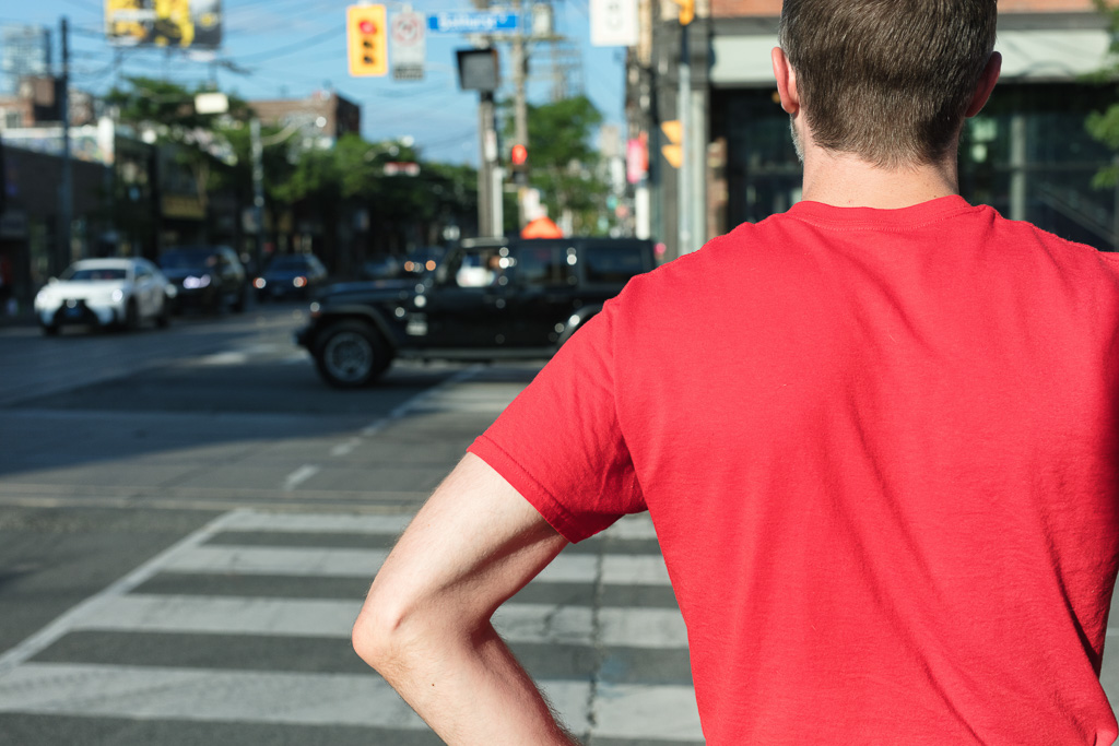
I want to share this photograph because I like the way the red T-shirt creates a single block of colour that dominates the image. And I like the way the left arm juts out at an angle that matches the angle of the crosswalk line. Finally, I like the way the late afternoon light washes the image in a yellow that shifts the blue just a little to green; it gives the image a faintly nostalgic feeling as if I had shot it with film. However, the image doesn’t show a person doing something. Nobody is doing anything. The man is just standing there, waiting.

What I love most about photography is the opportunities it gives me to embrace inconsistency, contradiction, and paradox. Introductory photo workshops will sometimes take a rule-based approach to making a good photograph: apply the rule of thirds, the golden-mean, remember foreground, middle-ground, background, visual tricks that more or less guarantee a decent result. Then there are the personal rules I impose on myself, like the rule of yesterday’s post: only shoot people when they are doing something.

The challenge of a rule-based approach is that, in a world where AI is reaching a critical mass, there’s little we can do in terms of image-making that an algorithm can’t do better. Our only advantage is our capacity for irrationality. Intuition, holy unreason, the embrace of irreconcilables. These are things we do with ease that would short-circuit a microchip. Increasingly, I think we will find that our most successful creative work ignores those rules that are reducible to algorithms.

Categories
Abstract

Blue Maple Sap Tubing

So ends the month of March which began with a series of posts on maple syrup production and wound down with photographs from Williams Farm, the property featured in my maple syrup posts. My final image shows large coils of sap tubing waiting to be strung out in the sugar bush. Although the tubing is clearly identifiable as such, I like the way it assumes an abstract quality, especially the blurred stacks of tubing in the background.

When I make abstract looking images in camera (i.e. images that haven’t been manipulated using post-processing software like Lightroom or Photoshop or Nik Effects), one of the challenges lies in giving the images meaningful labels. Every photograph is a photograph of something; the easiest approach is to label a photograph by naming the thing that it is a photograph of. So, for example, this is a photograph of blue maple sap tubing. Only it isn’t. Not really.

When I stumbled upon these coils of tubing stacked in the barn, I didn’t say to myself: “I’d like to document coils of blue maple sap tubing.” I was emphatically not moved to make this image because I wanted to produce a photographic record of one inch plastic tubing. Instead, I was struck by the colour; I was struck by the way the morning light passed through cracks in the barn boards and settled on the tubing; I was struck by the curved lines moving from top to bottom; I was struck by the way the horizontal lines receded into darkness. All of this coalesced in a way that made me feel something.

If I had wanted to say what I felt, I might have written a poem. But there was something about this arrangement that was irreducible to words, and so I made an image instead. That makes a label problematic. Since the image is irreducible to words, a label is necessarily inadequate. It may even be a distraction. The best I can do is offer a few provisional words with the understanding that they have nothing to do with the image except to distinguish it from other images. It is what it is.

Categories
Country Life

Maple Syrup’s Colours

If you were to celebrate maple syrup Pride, the colours of its rainbow would be Golden, Amber, Dark, and Very Dark. That’s according to the PPAQ web site and, since it manages more than 70% of the global maple syrup supply, that’s pretty much the end of the discussion. However, outside Québec, people tend to stick to three colours, not bothering to distinguish between Dark and Very Dark.

Along with the different colours are different flavour profiles. Turning again to the official web site, the PPAQ identifies the flavours as Delicate, Rich, Robust, and Strong. Or, since this is Québec, Délicat, Riche, Robuste, et Prononcé.

At Williams Farm, John Williams finds that a lot of veteran maple syrup customers prefer Dark. Unfortunately for John, he doesn’t have much control over colour profile. When the sap begins to run, the early boils produce syrup with a light colour profile (Golden). As things progress, the boils produce Amber … and many years that’s as far as it goes. For reasons related mostly to weather, the trees stop producing sap and get on with the business of producing buds and leaves. But sometimes if John’s lucky, the sap runs late and the last boils produce dark syrup and everyone goes mental over it.

Personally, I find that while the colour gradations are significant, the corresponding flavour profiles are exaggerated. If I were writing a crime piece, I would call them the alleged flavour profiles because, as they say in court, the jury is still out. In fact, there is a good body of evidence to suggest that the visual appearance of a food strongly influences our perception of flavour. This stands to reason given that nearly 50% of our cerebral cortex is devoted to processing visual information whereas only 1-2% is allocated to taste.

I’m inclined to think we describe the flavour of Golden syrup as delicate because it looks delicate while we describe the flavour of Dark syrup as robust because it looks robust. But actual differences in flavour are far less significant than we suppose. the fact is: both syrups have an extraordinarily high sugar content and sweetness dominates everything.

Naturally, I reserve the right to contradict myself in future posts.

Categories
Street Portrait

Singapore Street Portrait

Smiling woman wearing hat and sunglasses with red scarf

I made this image in Singapore when I tagged along with my wife who was working as a consular assistant. Singapore’s Ministry of Foreign Affairs had brought consular assistants from all around the world for a week of training. I came along for the ride, and while my wife sat all day in an office, I wandered around the island (Singapore public transit is fantastic!) while carrying a ridiculous amount of gear. This is one of those consular assistants. I can’t remember her name although I believe she is from Italy.

Perhaps it’s worth noting that I shot this in January. Now, I prepare this post sitting in my Toronto condo while, outside, the streets are covered in January snow and the temperature has dipped below -20ºC. In Singapore, the coldest temperature ever recorded is 19.4ºC and more typically hovers around a humid 30ºC.

Whenever I travel, I ask myself: would I want to live in this place? While Singapore has many things to commend it, four distinct seasons is not among them. I wonder how I would feel about living in a place without clear seasonal variation. The transitions, especially in spring and autumn, have an affective quality that I cherish: the feeling of optimism that comes as the snow melts and the ground thaws; the feeling of wistfulness as the leaves turn and the days shorten. I’m not sure I would want to live without these feelings.

Even so, like most Canadians, I enjoy it when I can interrupt my winter with a little time in the sun. This woman’s smile nicely captures that feeling of delight at being able to cast off heavy jackets and to bask in the warmth.

Categories
Street Photography

Seeing Red

Person stands on sidewalk wearing a maple leaf suit to promote a tax preparation service

By its association with blood, red is the colour of life. Paradoxically, red is also the colour of death because we rarely see blood except when it has been spilled.

In a roundabout way, red is also the colour of equality. We learn this from one of Shakespeare’s most marginalized characters. Shylock cries out: “If you prick us, do we not bleed?” Pierce the skin and what you find underneath is remarkably democratic.

Red has the longest wavelength of any colour on the visible spectrum (620-750 nm) which means, ironically, that it has the lowest level of energy. I say “ironically” because, when we set aside our scientific bias and examine matters from the more useful perspective of human emotions, we find that red is associated with high-energy feelings, like anger and passion. If we want to provoke a bull, we wave a red cape. If we want to evoke sexual passion, we put a woman in a red dress and call her Carmen. Bizet’s opera would have been considerably different if he had called it Violet; it would have been the story of a depressed banker.

Red is also the colour which appears on the flag of the country I call home. This is not so surprising given that Canada is one of the most sanguine countries in the world (as least by reputation). My use of the word “sanguine” is deliberate. According to medieval medicine, a person whose humour is dominated by blood (sanguinity) is cheerful and happy (like a good Canadian). And that happiness extends to happiness in bed too. Sexual passion.

I’m not sure how passionate a person has to be to stand around in a maple leaf suit trying to persuade people to use a tax preparation service. I’m guessing not much. Unless the pay is really good.

Categories
Street Photography

Orange is the new um Orange

Graffiti on concrete wall near the Bloor Street East overpass at Mount Pleasant Road, Toronto

When I was a kid in art class, I learned that you make orange by mixing red and yellow paints. As my art teacher told me, red and yellow are primary colours, and when you mix them, you get a secondary colour. With words like primary and secondary, what I took from his lesson was that orange is a lesser colour, maybe parasitic on the more legitimate colours. It has taken me a lifetime to undo that bias and give orange the recognition it deserves.

Part of the reason we don’t acknowledge orange as a colour in its own right is that, for centuries, at least in the English language, we didn’t have a word for it. In a book called On Color, by David Scott Kastan with Stephen Farthing, we learn that people used to describe the colour associated with wavelengths of 590 – 620 nm as red-yellow or yellow-red. It wasn’t until the people of England were introduced to a certain citrus fruit that the word “orange” began to describe things that share the fruit’s colour. And it wasn’t until the beginning of the 18th century that the word “orange” was used to denote the colour itself. So, yes, orange the fruit came before orange the colour and not the other way around. Just imagine what would have happened if people in England were introduced to the pumpkin first.

Categories
City Life

Beating the Drum for Yellow

Yellow Drummers march through Toronto's Bloor/Avenue Road intersection

Yellow shares the middle of the visible spectrum with green. Hovering somewhere between 570 and 590 nm, its wavelength is just a little longer and its energy just a little less than green’s.

Yellow is bright, sunny, uplifting. It is the colour of brilliant morning sunlight, the colour of a cracked egg sizzling on the frying pan, the colour of bumble bees spreading pollen through fields of goldenrod.

Despite the feelings of optimism that yellow can engender, it simultaneously holds negative meanings. A coward is yellow, refusing to face duty and preferring instead to flee.

Yellow has long been associated with a racist trope. The Chinese in particular, and Asians generally, have been called yellow. Since the end of the 19th century, Western political forces have toyed with the trope of the Yellow Peril as a way to manipulate anxiety and to galvanize public opinion. Donald Trump is only the latest in a long line of demagogues to leverage Western racism in this way.

Whenever I use my photography to celebrate the colour yellow, I hope, in some small way, to push back against these tiresome tropes.

Categories
Street Photography

It’s Not Easy Being Green

Walking up Yonge Street towards College Street while dressed all in green

The title for today’s post comes, of course, from Kermit the Frog, who faced discrimination for the colour of his skin. Amphibians have faced such discrimination since the first tiny tadpole sprouted legs and crawled from the primordial slime onto dry land.

Martians face similar discrimination as, historically, they’ve been known as “little green men.” Oddly, feminists have tended to ignore the sexism embedded in the “little green men” stereotype. When you think about it, though, there’s no reason little green women couldn’t be the ones who invade planet Earth. Maybe they need space for themselves because they’re sick of living with all those little green sexist bastards.

Vulcans have green blood. Ask a phlebotomist. It’s one of the first things they learn in Phlebotomy 101.

Ever since Othello killed poor Desdemona, we’ve called jealousy the “green-eyed monster.”

And people can be “green with envy” as Anne Shirley discovers when she dyes her hair.

Green is the colour of money, at least in America.

The colour green falls in the range of wavelengths from 495 to 570 nm on the visible spectrum of light. There is some debate about where blue ends and green begins but given the passion some people feel for such distinctions, I prefer to avoid this controversy altogether.

Personally, I am partial to green. In fact, we named my daughter “Green” but in Japanese because it sounds much more delightful as a Japanese word–Midori.

Categories
Street Photography

Feeling Blue

Walking outside the Royal Alexandra Theatre, 260 King Street West, Toronto

Picasso had a blue period.

The blues is a genre of music that takes its name from an emotional state.

Mild depression is a case of the blues. The cure is to sit on your stoop and play a guitar.

Beginning sometime around World War I, blue started to be associated with being a boy.

Shades of blue have wavelengths between 380nm and 500nm.

Pyroflatulence or flatus ignition (setting light to your farts) is commonly known as a blue angel.

Becoming a blue man can take from 10 weeks to 2 years. However, if you’re in a hurry, you can become a blue man by falling through ice in the middle of winter.

Categories
Street Photography

Purple Prose

Woman leans over a stroller and a baby stares up at her wondering: what the fuck?

The colour violet has the shortest wavelength on the visible spectrum (380-450 nm) and, given its high frequency, it has the most energy of any light that enters our eyeballs.

Violet—or its low class stand-in, purple—is a lavish, extravagant colour. Overblown writing is called purple prose. Overdressed musicians produce movies called Purple Rain. And people who think they’re better than us (i.e. royalty) use purple to reinforce that very rotten idea.

Most edible tubers can be purple. Beets are an obvious example. Despite our belief that carrots should be orange, that’s really a matter of marketing. Carrots would happily be purple if we let them. The same goes for potatoes.

If we fall down and hurt ourselves, a phenomenon called bruising turns our skin purple. And if our lover strangles us, we turn purple for pretty much the same reason (lack of oxygen in our blood).